102 lines
3.7 KiB
Markdown
102 lines
3.7 KiB
Markdown
# GMStepper
|
|
[](http://cocoapods.org/pods/GMStepper)
|
|
[](http://cocoapods.org/pods/GMStepper)
|
|
[](http://cocoapods.org/pods/GMStepper)
|
|
|
|
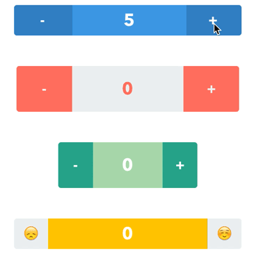
A stepper with a sliding label in the middle. Pan the label or tap the buttons. Check out the tutorial, [How to Build a Custom Stepper - Part 1](http://gmertk.github.io/custom-stepper-part-1/).
|
|
|
|
|
|
## Screenshot
|
|
|
|
|
|
|
|
|
|
## Usage
|
|
|
|
GMStepper is available through [CocoaPods](http://cocoapods.org). To install
|
|
it, simply add the following lines to your Podfile:
|
|
|
|
```ruby
|
|
use_frameworks!
|
|
pod "GMStepper"
|
|
```
|
|
|
|
## Setup
|
|
|
|
If you want to use storyboards, just drop a UIView into your storyboard and set its class to `GMStepper`. Then customize through the attributes inspector. Otherwise, you can write the code to initialize with frame and set the properties.
|
|
|
|
## Properties
|
|
```swift
|
|
/// Current value of the stepper. Defaults to 0.
|
|
var value: Double = 0
|
|
|
|
/// Minimum value. Must be less than maximumValue. Defaults to 0.
|
|
var minimumValue: Double = 0
|
|
|
|
/// Maximum value. Must be more than minimumValue. Defaults to 100.
|
|
var maximumValue: Double = 100
|
|
|
|
/// Step/Increment value as in UIStepper. Defaults to 1.
|
|
var stepValue: Double = 1
|
|
|
|
/// The same as UIStepper's autorepeat. If true, holding on the buttons or keeping the pan gesture alters the value repeatedly. Defaults to true.
|
|
var autorepeat: Bool = true
|
|
|
|
/// If the value is integer, it is shown without floating point.
|
|
var showIntegerIfDoubleIsInteger: Bool = true
|
|
|
|
/// Text on the left button. Be sure that it fits in the button. Defaults to "-".
|
|
var leftButtonText: String = "-"
|
|
|
|
/// Text on the right button. Be sure that it fits in the button. Defaults to "+".
|
|
var rightButtonText: String = "+"
|
|
|
|
/// Text color of the buttons. Defaults to white
|
|
var buttonsTextColor: UIColor = UIColor.whiteColor()
|
|
|
|
/// Background color of the buttons. Defaults to dark blue.
|
|
var buttonsBackgroundColor: UIColor = UIColor(red:0.21, green:0.5, blue:0.74, alpha:1)
|
|
|
|
/// Font of the buttons. Defaults to AvenirNext-Bold, 20.0 points in size.
|
|
var buttonsFont = UIFont(name: "AvenirNext-Bold", size: 20.0)
|
|
|
|
/// Text color of the middle label. Defaults to white.
|
|
var labelTextColor: UIColor = UIColor.whiteColor()
|
|
|
|
/// Text color of the middle label. Defaults to lighter blue.
|
|
var labelBackgroundColor: UIColor = UIColor(red:0.26, green:0.6, blue:0.87, alpha:1)
|
|
|
|
/// Font of the middle label. Defaults to AvenirNext-Bold, 25.0 points in size.
|
|
var labelFont = UIFont(name: "AvenirNext-Bold", size: 25.0)
|
|
|
|
/// Corner radius of the middle label's layer. Defaults to 0.0.
|
|
var labelCornerRadius: CGFloat = 0.0
|
|
|
|
/// Corner radius of the stepper's layer. Defaults to 4.0.
|
|
var cornerRadius: CGFloat = 4.0
|
|
|
|
/// Border width of the stepper and middle label's layer. Defaults to 0.0.
|
|
var borderWidth: CGFloat = 0.0
|
|
|
|
/// Color of the border of the stepper and middle label's layer. Defaults to clear color.
|
|
var borderColor: UIColor = UIColor.clearColor()
|
|
|
|
/// Percentage of the middle label's width. Must be between 0 and 1. Defaults to 0.5. Be sure that it is wide enough to show the value.
|
|
var labelWidthWeight: CGFloat = 0.5
|
|
|
|
/// Color of the flashing animation on the buttons in case the value hit the limit.
|
|
var limitHitAnimationColor: UIColor = UIColor(red:0.26, green:0.6, blue:0.87, alpha:1)
|
|
```
|
|
|
|
|
|
## Authors
|
|
|
|
* [Brent Whitman](https://github.com/bwhtmn) - Maintainer
|
|
* [Günay Mert Karadoğan](https://github.com/gmertk) - Creator
|
|
|
|
## License
|
|
|
|
GMStepper is available under the MIT license. See the LICENSE file for more info.
|
|
|
|
|